Establishing a foundational design system to support scalability for a cross-platform AI-powered application
Role
As Lead Product Designer at vAIolin, an early-stage startup, I helped shape product strategy from day one–defining a feasible MVP, validating the core problem, and laying the design and engineering foundations to scale through a robust design system. As the sole designer, I facilitated the end-to-end design process within the company. I translated a complex AI platform into a user-friendly product, partnering closely with founders and engineers on product vision and strategy.
Timeline
Jan 2025 – Present
Team
Product Designer (me)
+ 2 Founders & 1 Software Engineer
Tools
Figma
Miro
Whimsical
Scope
Product Strategy, Design System, UX/UI, Prototype
Context
This case study focuses on the process of building vAIolin’s design system from the ground up.
vAIolin is an early-stage startup that builds a cross-platform, AI-powered learning platform for violin students, connecting teachers and parents in one experience. The app design process is a 0-to-1 journey that translates complex AI-driven analysis and feedback into an intuitive, user-friendly experience for violinists. The process is as follows:
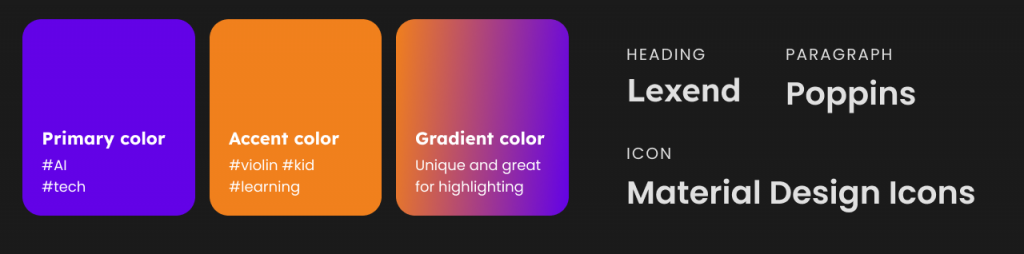
Defining Branding and Visual Strategy
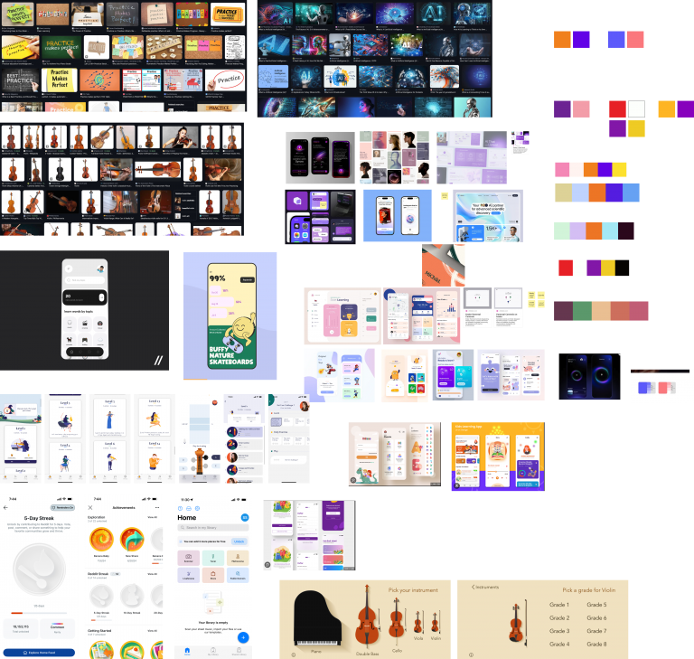
Moodboard and Inspiration
When defining the brand and visual strategy, it was important to avoid making stylistic decisions based solely on personal preference or assumptions. Instead, we grounded our choices in clear rationale. Working closely with the founders, we conducted visual research and created mood boards to explore and align on how the product should look and feel.
Because familiar and widely accepted visual patterns influence adoption and perception, I identified four core product keywords: (omitted due to confidentiality). I then researched how these concepts are commonly represented visually by collecting screenshots from search engines and platforms like Pinterest and Dribbble, and synthesized the findings into several color palettes. These palettes reflected the colors users generally associate with each keyword.
Example screenshot of our collective moodboard
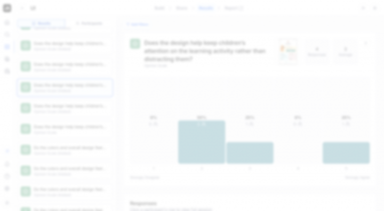
Example screenshot from Maze.co survey (Blur due to confidentiality)
Deciding between options
We narrowed the exploration down to three visual directions, defined by color palettes, typography, and imagery. To evaluate them objectively, I set up an anonymized, randomized rating survey in Maze.co and shared it with the team. Each option was rated against criteria centered on emotional engagement, educational alignment, age-appropriateness, attention support, visual friendliness, and clarity of interaction.
Building a foundational Design System
As the first design, establishing a design system was critical to laying a strong foundation for the product to scale both in design and engineering. I built the design system that achieved the following goals:
Faster, clearer handoff between design and engineering.
Single source of truth for designers, engineers, and founders.
Consistent and flexible for future updates
Empowered teams to collaborate, iterate, and make updates without relying on designers for every change.
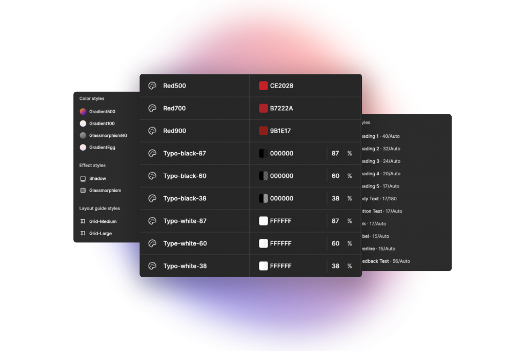
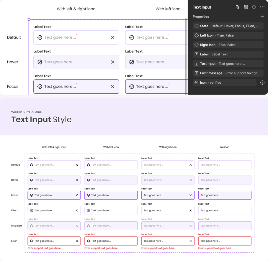
Design tokens replace hardcoded values (e.g., hex codes, radius, font size, etc.) with meaningful names (e.g., Primary500) to make the app easier to manage and scale. Collaborating with front-end engineers, we created and maintained a consistent token system that is used across every components and screens.
This makes it much more convenient and easier to update things in the future, especially small, foundational elements like colors and text styles, as well as components such as buttons or text input fields. Since we’re a startup, change is inevitable, and design tokens allow those changes to be applied consistently and immediately across the entire app, in both design and code.
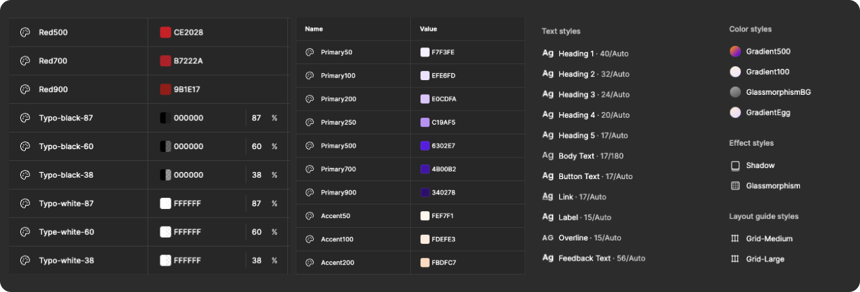
Example screenshot of design tokens in Figma
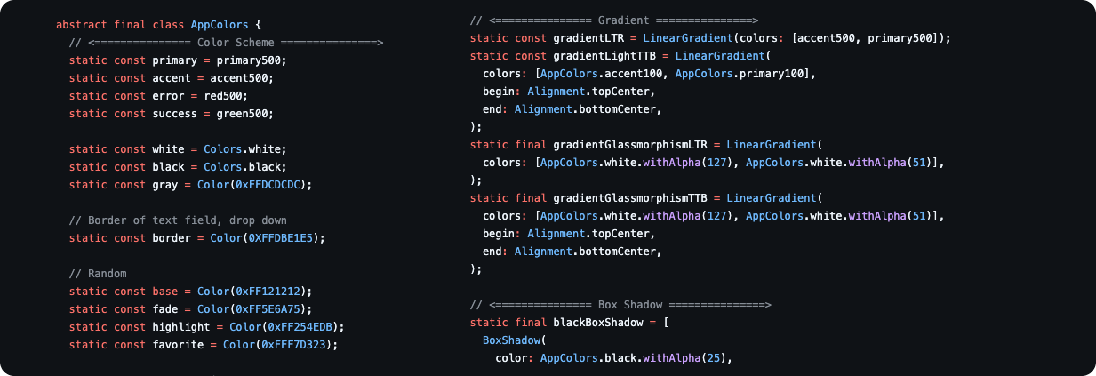
Example of design tokens implemented in code
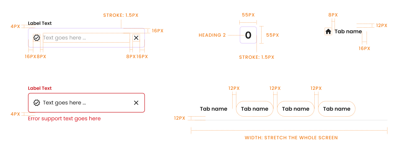
Specs
While spacing and sizing are available in Figma, I found that engineers could still miss critical spacing and specification details without clear documentation. As a result, each component is accompanied by explicit specs covering padding, spacing, typography, and other essential values. This makes the handoff much more efficient by minimizing the need for detailed explanations of each element.
Scalable and accessible to others
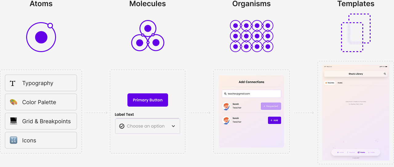
One of the goal for this Design System is that it can expand in the future and be used by other people–new designers in the future, founders, etc. What helped me keep elements accessible and usable in Figma was sticking to atomic design methodology, set up components for responsive, use nested components, and using component properties to make the change of variants easier.
Project takeaway
Being the sole designer means more than just designing
Being the sole designer means acting as the facilitator of the entire design process. It involves actively engaging stakeholders and creating space for all team members to contribute. Throughout the project, I worked closely with founders and engineers, continuously communicating design decisions and facilitating discussions that incorporated diverse perspectives while surfacing issues early. This collaborative approach led to more informed design decisions, helped me articulate design rationale more clearly, and resulted in stronger alignment and higher stakeholder satisfaction.